Designing a Snowboard for Michelle Salt, 2018 Paralympian
As a graphic artist, I'm constantly reminded that design opportunities are everywhere. One of the most unexpected-and rewarding-projects I've ever taken on came through a simple word-of-mouth referral. Last summer, my friend Heather connected me with Michelle Salt, a Canadian Paralympic snowboarder, who was in search of a designer for her 2018 race board.
After discussing a few design concepts I'd put together, Michelle selected one she connected with, and I was honored to be offered the job. I never imagined I'd have the opportunity to create a snowboard design that would be seen on the slopes of the PyeongChang 2018 Paralympic Winter Games-an incredible milestone in my creative journey.
About Michelle:
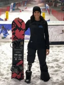
“She was in a life-threatening motorcycle accident June 27, 2011 that left her on life support for 7 days, broke numerous bones, having to endure many surgeries and in the end, lost her right leg above the knee.[2] She is now a National team athlete for the Canada Snowboard para-team and also working towards making the National para-cycling team. She was selected in February 2014 to compete in the 2014 Winter Paralympics in Sochi, Russia and upon competing, became the first Female Canadian Paralympic Snowboarder.[3][4] She is currently reigned National Champion in Canada and in January 2015, made her first World Cup Podium on home turf at Big White finishing 3rd.” (source)
The Design Concept:
With such a powerful story behind her, I wanted the snowboard design to carry meaning-something deeply personal that would motivate her each time she looked down at the board.
Michelle's last name, Salt, sparked the inspiration. The word 'salt' itself is rich in symbolism:
- Salt seasons
- Salt heals
- Salt preserves
- Salt thrives in many forms
I incorporated these metaphors into a crystalline design inspired by salt formations. Michelle had also shared that she loved bears, maple leaves, mountains-'anything Canadian'-so those themes found their way into the concept as well.
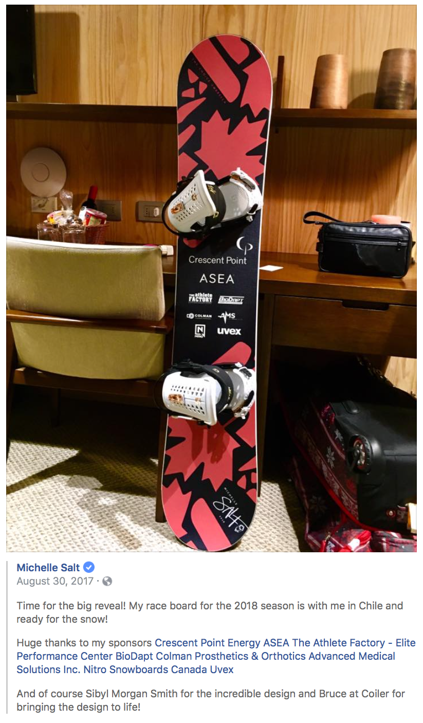
The concept board featured bright red tones, nods to Canadian identity, and a maple leaf embedded in a stylized salt crystal. After reviewing the options, Michelle chose design #2 as her favorite.
Working under a tight deadline, I finalized the board layout and integrated her sponsor logos. One challenge I hadn't anticipated was aligning the artwork so it wouldn't be covered by the bindings-a good reminder for future board layouts!
The final design features Michelle's name and logo in white at the tip of the board, with sponsor logos placed front and center.


Seeing It in Action
A few months later, I finally saw the board in action-thanks to Michelle's social media posts. To witness my design on the world stage, under such inspiring circumstances, was an unforgettable experience.
I'm not just following Michelle's journey now because my work is involved-I'm genuinely moved by her strength, grit, and determination. She's a role model for so many, including me.
The PyeongChang 2018 Paralympic Winter Games began on March 8. NBC announced an exciting increase in coverage, with 94 hours of televised content-nearly double what was offered during Sochi 2014.
We'll be cheering for you all the way, Michelle!